| | Website Banner Contest! |  |
|
|
|
| Author | Message |
|---|
kigbariom
Admin

Posts : 727
Points : 12012
Reputation : -101
Join date : 2009-05-14
Age : 30
Location : India (I'm not Indian)
| | Subject: Website Banner Contest! Thu Mar 04, 2010 9:56 pm | |
| It's time we had a nice looking banner here, so I think we should have a contest ending next monday. What is needed Size is up to you, but 600x500 pixels is good for example. It has to say PGTF2 It has to match the forum's layout in either it's simplicity, or already established blue color scheme. That's it.  | |
|
| | |
Arylikh
Posts : 51
Points : 10441
Reputation : 1
Join date : 2010-03-04
Location : sarawak,Malaysia
| | Subject: Re: Website Banner Contest! Fri Mar 05, 2010 8:43 pm | |
| Your mid column is fluid width you might want to fix that or the banner would look weird. Prolly the body size. k 600x500 it is,will do if i have time. | |
|
| | |
kigbariom
Admin
Posts : 727
Points : 12012
Reputation : -101
Join date : 2009-05-14
Age : 30
Location : India (I'm not Indian)
| | Subject: Re: Website Banner Contest! Sat Mar 06, 2010 2:22 am | |
| - Arylikh wrote:
- Your mid column is fluid width you might want to fix that or the banner would look weird. Prolly the body size. k 600x500 it is,will do if i have time.
That's not exactly true. Although the big blue banner is fluid, see the tiny line in the low center of the banner, that is the actual banner, and it is empty. If I put something there, the blue will go away, and it will be replaced with a banner. | |
|
| | |
mikybee93
Posts : 23
Points : 11007
Reputation : 7
Join date : 2009-05-18
Age : 30
Location : India
| | Subject: Re: Website Banner Contest! Sat Mar 06, 2010 2:43 am | |
| 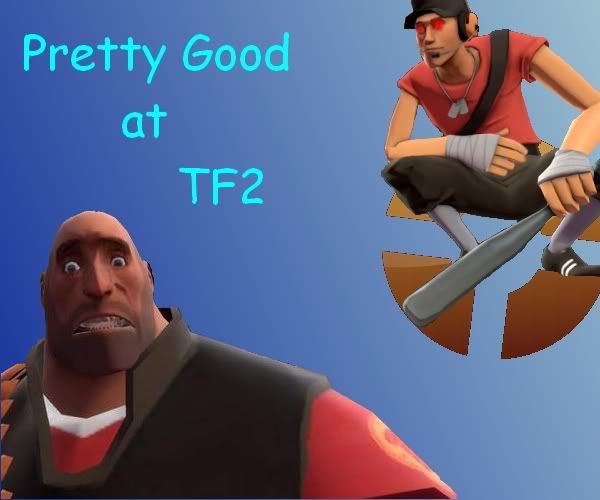 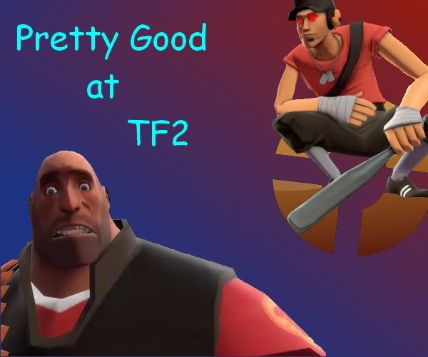 Simplistic and sort of color coded. I'm no good at art, but it's my attempt =) | |
|
| | |
kigbariom
Admin
Posts : 727
Points : 12012
Reputation : -101
Join date : 2009-05-14
Age : 30
Location : India (I'm not Indian)
| | Subject: Re: Website Banner Contest! Sat Mar 06, 2010 2:54 am | |
| Scouts aren't evil, don't make them have red eyes. | |
|
| | |
Reginald Carl II

Posts : 281
Points : 10755
Reputation : 11
Join date : 2010-03-04
Location : Malaysia
| | Subject: 15nops Sat Mar 06, 2010 2:45 pm | |
| Well, I can think something up. I kind of like the way Mirror's Edge does that red shattered pattern throughout the game, so.
Maybe I can work up on that and see where it goes. Also, Mikey's has an evil scout. He deserves rep. :I | |
|
| | |
MC-117

Posts : 546
Points : 11068
Reputation : 18
Join date : 2010-03-04
Location : Afghanistan
| | Subject: Specs! Sat Mar 06, 2010 6:10 pm | |
| Ideal Banner size should be 785 x 160 pixels
DPI should be around 300 (HQ) or 200 (LQ) Recommended is 300 DPI
Last edited by MC-117 on Sat Mar 06, 2010 7:28 pm; edited 1 time in total | |
|
| | |
mikybee93
Posts : 23
Points : 11007
Reputation : 7
Join date : 2009-05-18
Age : 30
Location : India
| | Subject: Re: Website Banner Contest! Sat Mar 06, 2010 6:47 pm | |
| Why is that the ideal resolution?
Just wondering how you came to that conclusion. | |
|
| | |
MC-117
Posts : 546
Points : 11068
Reputation : 18
Join date : 2010-03-04
Location : Afghanistan
| | Subject: Re: Website Banner Contest! Sat Mar 06, 2010 7:30 pm | |
| - mikybee93 wrote:
- Why is that the ideal resolution?
Just wondering how you came to that conclusion. What you mean for the banner is the blank blue box on top. I measured the element under 1280 x 900 resolution so yeah... | |
|
| | |
kigbariom
Admin
Posts : 727
Points : 12012
Reputation : -101
Join date : 2009-05-14
Age : 30
Location : India (I'm not Indian)
| | Subject: Re: Website Banner Contest! Sat Mar 06, 2010 8:04 pm | |
| Again, the banner is not the blank blue box, the very thin line is the actual banner, so once we get rid of that and it is replaced with a new banner, the blue box will disappear. | |
|
| | |
MC-117
Posts : 546
Points : 11068
Reputation : 18
Join date : 2010-03-04
Location : Afghanistan
| | Subject: What!? and Yeah! Sat Mar 06, 2010 8:08 pm | |
| - kigbariom wrote:
- Again, the banner is not the blank blue box, the very thin line is the actual banner, so once we get rid of that and it is replaced with a new banner, the blue box will disappear.
What? I'm confused... where is the very thin line you speak? Anyways [img]  [/img] Tadaa! Here you go. I'm credit to team I did thing around 40 mins so any improvements please knock me up. | |
|
| | |
Reginald Carl II
Posts : 281
Points : 10755
Reputation : 11
Join date : 2010-03-04
Location : Malaysia
| | Subject: Lotsa triangles Sat Mar 06, 2010 9:06 pm | |
| Lotsa triangles. Lots and lots of triangles.  or My dA page if the one over there cuts off.Which it does. Full view to get an idea of it. Didn't really take me long, 15-20 min., which explains why it's too simple. @MC, I think the little thin line Kig's talking about is the bottom of the blue box.See how the rounded edges of the blue box cut off? I believe that's where it is. EDIT: I like MC's a lot better than mine. | |
|
| | |
MC-117
Posts : 546
Points : 11068
Reputation : 18
Join date : 2010-03-04
Location : Afghanistan
| |
| | |
mikybee93
Posts : 23
Points : 11007
Reputation : 7
Join date : 2009-05-18
Age : 30
Location : India
| | Subject: Re: Website Banner Contest! Sun Mar 07, 2010 4:04 pm | |
| MC, the box you measured is fluid, so the measurements you took will only work on computers of your same resolution.
Ex: Restore your screen down (un-maximize it) and then make it smaller and bigger by dragging the edges, the blue box changes in length. | |
|
| | |
kigbariom
Admin
Posts : 727
Points : 12012
Reputation : -101
Join date : 2009-05-14
Age : 30
Location : India (I'm not Indian)
| | Subject: Re: Website Banner Contest! Sun Mar 07, 2010 7:36 pm | |
| Carl. make sure the banner says PGTF2, but it looks cool! | |
|
| | |
MC-117
Posts : 546
Points : 11068
Reputation : 18
Join date : 2010-03-04
Location : Afghanistan
| | Subject: So what now? Sun Mar 07, 2010 8:36 pm | |
| What is the ideal resolution? Surely I'm not going to make a 5 x 787 banner :I | |
|
| | |
Arylikh
Posts : 51
Points : 10441
Reputation : 1
Join date : 2010-03-04
Location : sarawak,Malaysia
| | Subject: Re: Website Banner Contest! Sun Mar 07, 2010 9:52 pm | |
| Mmm generally, for 800x600 screens a banner ought to be about 750x150px or something near that number. The blue blank rectangle provides a good height i believe. So if you choose a width of 750-ish then it would be optimized for 800x600 users. People with larger screens will see that the banner is just smack in the middle(unless kig change the alignment to left or right). To make matters simple, the best width will probably be nothing less than 700 just for testing and then when kig has tested it the winning banner can be re-sized to fit in with the proper required width.
After Saying all that, I haven't started doing one! lolz. Mines gonna be 785x160 px aswell, it's like... a common measurement i think. Ah and for dpi, 72 should be ok. 300dpi is minimal for prints but web graphix dont need to be that high(big).
Cheers~~! | |
|
| | |
MC-117
Posts : 546
Points : 11068
Reputation : 18
Join date : 2010-03-04
Location : Afghanistan
| | Subject: Re: Website Banner Contest! Sun Mar 07, 2010 11:08 pm | |
| - Arylikh wrote:
- Mmm generally, for 800x600 screens a banner ought to be about 750x150px or something near that number. The blue blank rectangle provides a good height i believe. So if you choose a width of 750-ish then it would be optimized for 800x600 users. People with larger screens will see that the banner is just smack in the middle(unless kig change the alignment to left or right). To make matters simple, the best width will probably be nothing less than 700 just for testing and then when kig has tested it the winning banner can be re-sized to fit in with the proper required width.
After Saying all that, I haven't started doing one! lolz. Mines gonna be 785x160 px aswell, it's like... a common measurement i think. Ah and for dpi, 72 should be ok. 300dpi is minimal for prints but web graphix dont need to be that high(big).
Cheers~~! Oh yeah *faceplam*, forgotten my design theory  Thanks for the info. | |
|
| | |
Arylikh
Posts : 51
Points : 10441
Reputation : 1
Join date : 2010-03-04
Location : sarawak,Malaysia
| | Subject: Re: Website Banner Contest! Sun Mar 07, 2010 11:15 pm | |
| For example this is my first made up:  Its at 785px x 160px and 300dpi. Pirated theme from Tf2 official.  The layout is for right aligned banner. Ah! for ideas you might wanna look at the TF2 propaganda results here http://www.teamfortress.com/post.php?id=3391 | |
|
| | |
kigbariom
Admin
Posts : 727
Points : 12012
Reputation : -101
Join date : 2009-05-14
Age : 30
Location : India (I'm not Indian)
| | Subject: Re: Website Banner Contest! Mon Mar 08, 2010 1:33 am | |
| Contest submissions end, in... uh, 2 days
I like Moi's quite a bit, but, I hope its not too pirated so we can't use it. | |
|
| | |
Arylikh
Posts : 51
Points : 10441
Reputation : 1
Join date : 2010-03-04
Location : sarawak,Malaysia
| | Subject: Re: Website Banner Contest! Mon Mar 08, 2010 4:16 am | |
| Thanks. It's usable as most of the pictures come from valve themselves. I don't have much time. Since its 2 more days that's good news. For others who'd like to create banner or searching for ideas this fankit collection seems to be good. Thought i haven't actually tried it. http://forums.steampowered.com/forums/showthread.php?t=948441I'm resubmitting previous banner in png here so that it fits whatever background color. (i think) 
Last edited by Arylikh on Mon Mar 08, 2010 7:29 pm; edited 1 time in total (Reason for editing : Stupid spelling mistake.) | |
|
| | |
kigbariom
Admin
Posts : 727
Points : 12012
Reputation : -101
Join date : 2009-05-14
Age : 30
Location : India (I'm not Indian)
| | Subject: Re: Website Banner Contest! Mon Mar 08, 2010 3:15 pm | |
| Ok, that's good, depending on how we change the layoutor background I'll choose one of those images. So far I think Moi's is official. | |
|
| | |
Reginald Carl II
Posts : 281
Points : 10755
Reputation : 11
Join date : 2010-03-04
Location : Malaysia
| | Subject: Team Fotress. Mon Mar 08, 2010 3:50 pm | |
| My only tiff is the spelling. D: (Team Fotress 2, anyone?)
Otherwise it's amasing, kamerad! | |
|
| | |
MC-117
Posts : 546
Points : 11068
Reputation : 18
Join date : 2010-03-04
Location : Afghanistan
| | Subject: Re: Website Banner Contest! Mon Mar 08, 2010 4:27 pm | |
| I like it alot but I feel that the font is about "unserious". Kinda kills the scrimming atmosphere Wanna combine forces? I hook up my psd. in my dA | |
|
| | |
kigbariom
Admin
Posts : 727
Points : 12012
Reputation : -101
Join date : 2009-05-14
Age : 30
Location : India (I'm not Indian)
| | Subject: Re: Website Banner Contest! Mon Mar 08, 2010 6:44 pm | |
| oh god, I didn't even notice it was spelled wrong.
Also Carl, you don't have to title the posts, just leave it blank. Almost all forums have a place for a title but they aren't used. | |
|
| | |
Sponsored content
| | Subject: Re: Website Banner Contest! | |
| |
|
| | |
| | Website Banner Contest! | |
|